


Introduction
Scan the blogs and insights pages of most agency websites, and you’ll see that product detail page (PDP) advice is written with a £30 product in mind; remove friction, streamline path to purchase, make it easy to buy etc. And that works when you are selling lower-ticket products where the risk for the customer is relatively small.
But if you are selling £800 dining sets, £1,200 sofas, or £10,000 outdoor kitchen units, then that advice can actively work against you.
High-ticket home and garden products need a completely different product page strategy to reflect the psychological reality. The customer isn’t making the same impulse decision. They are making a carefully considered, calculated and well thought out choice which often involves partners, multiple website visits and a tape measure.
Considered purchases require considered commerce which means your PDP needs to meet them where they actually are in this process.
The core shift: from reducing friction to reducing risk
For a cheaper product, the PDP page needs to get out of the way, keep it simple and make the call-to-action impossible to miss. Let the customer get on with it and order the product.
On a high-ARP product, the job is almost the opposite. You need to slow the customer down and answer every doubt before it becomes a reason to leave.
The question is fundamentally different:
- Not – “How do I make it easier to buy?”
- But – “What is stopping this person from feeling confident enough to buy?”
This changes almost every decision you need to make on the page.
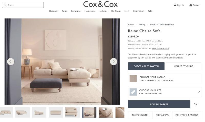
Below is taken from Cox & Cox, a leading high end furniture retailer. In this relatively small box below the price, the customer has the following:
- Finance options
- Delivery timeframe
- Brief description of product
- ‘Order a free swatch’
- ‘Will it fit guide’
- Customisation of fabric and sizes
- Add to basket
- Link to ‘Buyer’s Notes’
- Size Info
- Link to delivery and returns policy
For a small area of the PDP, this is an incredible amount of detail covered. In doing so, the customer has every bit of information they might need to give them confidence to buy.
Hero section: lead with the room, not the price
With low-ticket items, the price is often the hero. It’s the hook which creates the impulse. However, leading with price before establishing value is a mistake with high-ticket items.
Your hero section should do one thing: make the customer picture your product in their home.
This can mean photography of the item in use as the primary image instead of a white background, scale reference shots showing a person or a real room, multiple angles as standard and even a video or 360 degree view if possible.
Of course, the price is still on the page and you are not hiding it. But the customer has already fallen in love with your product before looking at the cost.
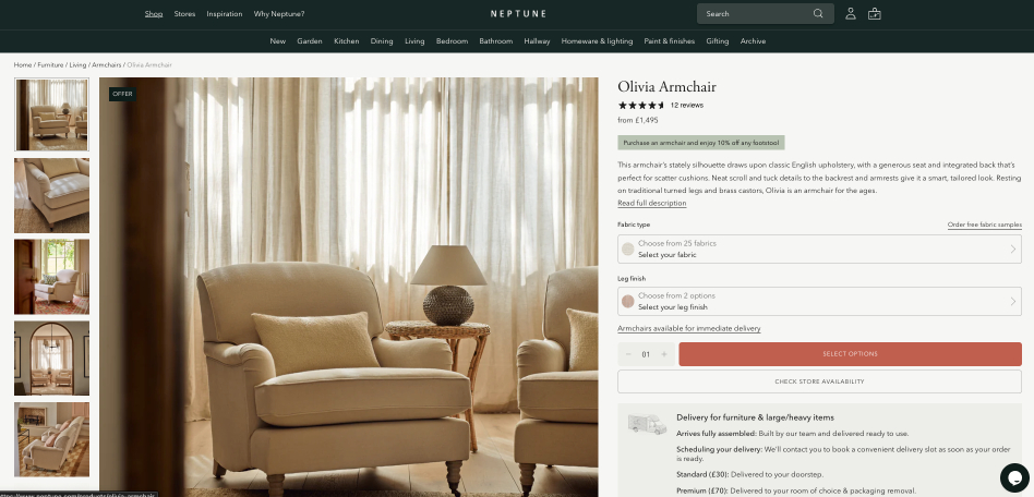
Below is from Neptune. The imagery shown of the armchair is all in situ and dwarfs the pricing. It is also very warm and inviting. This is a great example of how in-use-photography can elevate a PDP and help customers fall in love with your product before looking at the cost.
Social proof: more than some 5 star reviews
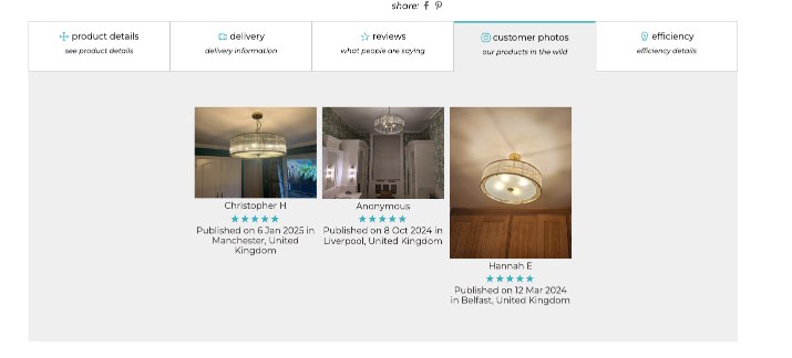
When it comes to high-ticket items 400 generic reviews are far less persuasive than 15 detailed, photo-rich reviews from real customers.
Customers are looking for proof of fit – evidence that real people have bought this, put in a home just like the customer’s and it has worked.
Think named testimonials with context (e.g. ‘We have two dogs and the sofa held up brilliantly’), press mentions and awards if you have them and a clear returns and guarantee policy surfaced right on the page. Not a weblink to another page; all upfront.
Product details: depth = quality
A bullet point spec list is okay for a t-shirt. But when it comes to a £1,000 outdoor sofa, this just looks lazy.
High-ticket home and garden PDPs need to go deeper than practical details and dimensions. They need guidance on whether it fits through a standard doorway, materials with origin and rationale. Construction method, where terms like ‘8-way hand-tied springing’ or ‘dovetail joinery’ communicate artisanship to people who understand, and show quality to those who might not. And longevity signals, warranty length and what it covers.
The goal is not to overwhelm. It’s to give customers the story so they understand what they are buying and remove any doubt.
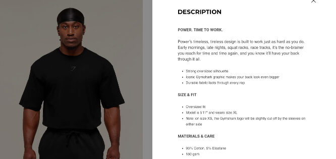
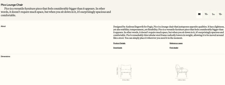
Below are two examples of successful e-commerce retailers; Gymshark and Fogia. However, their PDPs are vastly different despite them both being hugely successful.
The t-shirt has a brief description, bullet point details and is hidden under a tab below the price.
However, the furniture retailer provides an intricate description, design back-story, dimensions with further imagery and even sublinks for further information.
These two examples show how a strong PDP page is very different for a High Ticket E-Commerce store.
Don’t forget delivery
A t-shirt will likely fit through a letterbox. A 70kg sofa won’t. Delivery can be a major source of concern. Therefore use your PDP page to alleviate this.
Free delivery doesn’t cut it when a customer is spending four figures. Customers need to know whether it arrives flat-pack or assembled, whether it will be left on the doorstep or taken inside, who is delivering it and what will happen with the packaging.
White Glove delivery is a huge advantage if you offer it. Use your PDP to shout about it.
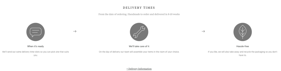
Darlings Of Chelsea do a great job in making this clear for their customers as seen below. The image shows an annotated delivery process and timeline, leaving no doubt in customer’s minds.
Objection handling deserves its own section
Common objections for home and garden products are predictable: will this fit through my door, what if the colour looks different in real life, can I see it before I buy, what if I hate it when it arrives. And these internal conversations are killing sales but never show up on abandoned cart reports because they never make it there.
A dedicated objection-handling block on the PDP — not a buried FAQ tab — can make a significant difference. Address the main questions you know customers have. Surface your finance options here if you offer them. Include a direct route to a human via chat, callback, or click-to-call for customers who need reassurance beyond what text can give.
Make it easy for customers to objection-handle themselves.
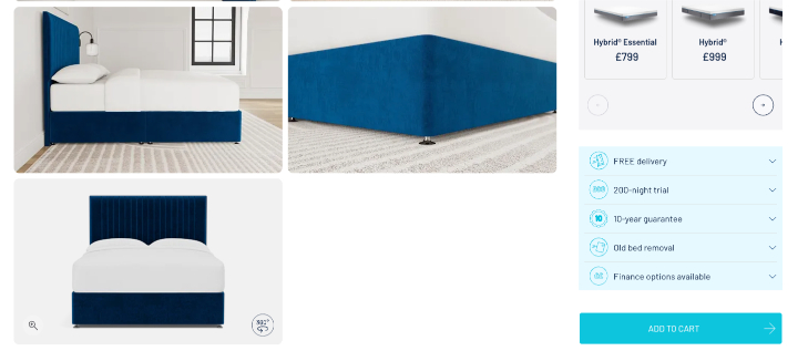
Here is a great example of this from Simba Sleep. Immediately after the pricing boxes on the PDP the customer can expand on the following using a simple dropdown:
- Free Delivery
- Sleep Trial
- Guarantee / Warranty
- Old Bed Removal
- Financing Options
Simba Sleep clearly understands what their potential customers want to know, so prioritise getting the answers across on the PDP.
Most visitors won’t buy today – and that’s good
On a cheap product, if the customer doesn’t add to cart on this visit, they’re gone. On a high-ticket item, your best customers are on visit two, three, or four. They came back because they kept thinking about the product, because they measured the space, or because their partner finally agreed.
Your PDP needs to capture intent from visitors who aren’t ready to buy yet — a prominent wishlist, a request-a-swatch CTA, an easy way to share the page, and an email notification for out-of-stock items. The CTA strategy shifts from a single “add to bag” to a hierarchy: primary conversion action, secondary intent-capture action, and a human contact route for high-anxiety buyers.
We rarely spend four-figures without thinking it through, so why should we expect our customers to be any different?
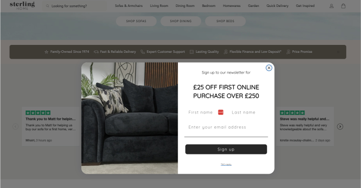
We love the tactic below for Sterling Home – upon entering their website, customers are prompted to enter their details for a £25 discount. No brainer, right? A discount is always appreciated but this is not what’s important here.
The retailer now has the customers email and name so they can be re-engaged. This is crucial in an industry where we know customers aren’t likely to buy on their first visit and worth infinitely more than the value of a nominal discount value.
Brand confidence belongs on the PDP
On a low-ticket product, you don’t need to sell the brand on the product page. On a high-ticket item, a customer spending £800+ wants to know who they’re buying from. A brief brand or founder story works hard here. So do sustainability credentials, craft heritage, and press logos if you have them. These signals reduce perceived risk, and perceived risk is the primary barrier to high-ticket conversion.
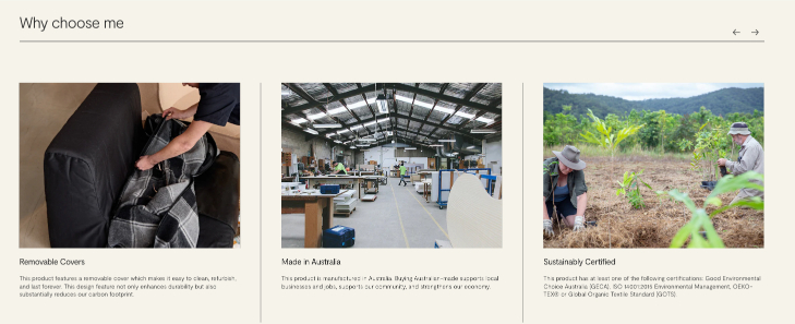
The image below is taken from Koskela – a prominent furniture retailer in Australia. Below the main details of the furniture is a ‘Why Choose Me’ section.
This clearly details three unique reasons that you might want to buy from them and thanks to their content, go a long way in building this trust.
Summary
The tactics that work for fast-fashion don’t work for considered, high-value purchases — and the gap between the two is wider than most people think. Implementing generic advice will be doing far more harm than good.
We work exclusively with Shopify merchants selling higher-priced home and garden products. If you’d like a second opinion on your PDPs, get in touch for a no obligation chat.