


Here are the top 10 things that get missed in Home & Garden e-commerce (and how to fix them).
Treating product pages like killer sales people instead of consultants
A salesperson closes. A consultant helps someone make the right decision and in doing so, earns the sale anyway. Many product pages are built to push: bold CTAs, countdown timers, “only 3 left in stock.” Urgency has its place (some products genuinely do sell out), but manufactured pressure lands badly when the customer is still working out whether the product is right for them.
The consultative approach, more generous with information and more focused on fit than on the hard sell, builds trust. And trust is what closes the sale.
How to fix: Rebuild product pages around the customer’s decision, not the product’s features. That means answering the questions a good in-store consultant would answer: What size room is this for? How does it live day-to-day? What does it pair well with? Is this right for a household with young children or pets?
Look at the questions your customer service team fields every week. Those are the exact doubts sitting between the visitor and the Add to Cart button. Put the answers on the page, in plain language, before the customer has to ask.
The best product page feels like a conversation with someone who knows the product inside out and genuinely wants you to make the right call, even if that means telling you when something isn’t quite right for your space.
That’s the kind of page that gets bookmarked, shared, and bought from.
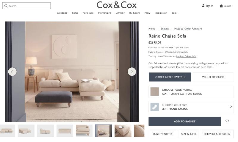
Above is taken from Cox & Cox, a high end furniture retailer. In this small snippet, the customer can find anything from a ‘will it fit guide’, to delivery information and even order a free swatch. Along with the customisation features, this achieves the consultative approach well.
Ignoring the consideration gap between browse and buy
Many Home & Garden customers don’t buy on their first visit. They browse, compare, check measurements, discuss it with their partner and come back later. For a garden accessory that might be a few days; for a dining set it could be months. Yet most stores are built for the single-session sale, with nothing in place for the return journey.
How to fix: Plan for re-engagement. Wishlists, “save for later,” browse abandonment emails that bring people back to the products they viewed, and retargeting that shows the exact item they considered. Make it easy for someone to pick up where they left off, whether that’s three hours or three weeks later. The sale you lose to a forgotten tab is often the easiest one to win back.
Underestimating how emotional a home purchase really is
People buy for their homes and gardens because they want to feel something: pride, comfort, calm, style. That’s as true of a string of garden lights as it is of a corner sofa. Yet most product copy is written in bullet points, sparse of vivid language. Rational information for an emotional decision.
How to fix: Lead with the feeling, then back it up with the facts. “The kind of garden that makes you stop rushing and start staying” should come before the dining set seats eight. Help customers fall in love with the product first, then reassure them with the detail. Write about the lifestyle the product creates, not just the object itself.
Letting post-purchase go silent when it should be building loyalty
The sale isn’t the end of the customer journey; it’s the start of the relationship. Home & Garden customers who have a great experience come back for the next room, the next season, the next project. They recommend you to friends, and they leave the reviews that convert your next customer. But most retailers send an order confirmation, a dispatch notification and then nothing.
How to fix: Build a post-purchase sequence that keeps the conversation going. That could be a delivery check-in, a message a week later asking how they’re getting on, care tips specific to what they bought, or an invitation to share a photo. For many Home & Garden products there’s a natural repeat purchase to prompt too: furniture covers, refills, or a seasonal reminder that it’s time to prepare the garden for winter. None of this needs complex automation. A thoughtful four or five-email flow, well timed, will outperform a lot of loyalty programmes.
Forgetting that most shoppers are imagining, not just browsing
When a customer looks at a product for their home, they’re not just looking at the product; they’re picturing it in their space. Will the colour work with the walls? Will it fit on the patio? How big is it really? If that’s hard to answer, the purchase stalls.
How to fix: Make it easy for customers to picture your product in use. Lifestyle photography in realistic settings, scale shots (“shown on a 1.2m windowsill”), video walkarounds and customer photos all reduce the effort of imagining it at home, and none of them requires a big budget. At the more ambitious end, room planners, configurators and AR “place it in your space” tools can turn imagination into confidence. Whatever your budget, a few studio shots on a white background isn’t enough.
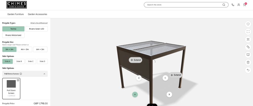
Chimes have recently implemented a 3D Pergola builder. Not only can you customise and edit your Pergola, but through the clever use of AR, customers can see how it will look on their home. This helps bridge the gap between imagination and reality.
Not planning around the Home & Garden calendar
Few sectors are as seasonal as Home & Garden. The first warm weekend in spring, summer entertaining, autumn planting, cosy season and Christmas all drive sharp changes in what people want and when they want it. Yet many stores run the same homepage, the same featured products and the same emails all year round, reacting to demand rather than getting ahead of it.
How to fix: Build a trading calendar and plan your merchandising, content and email around it. Start seasonal campaigns long before the peak, when customers are researching and planning, not once the rush has already started. Refresh your homepage and collections to match what people are thinking about right now, and make sure stock, delivery promises and cut-off dates are clear when demand spikes. The retailers who win the season are usually the ones who were ready for it first.
Neglecting the cross-sell
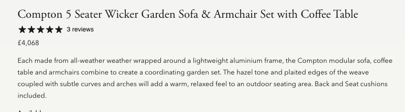
Someone adds a garden sofa set to their basket. That’s a £1,800 decision. At that moment, they’re already in buying mode and the process has started. It’s the perfect moment to suggest the outdoor rug, the parasol base, the protective cover, the scatter cushions. The same applies at smaller scales: the pot needs a saucer, the plant needs compost, the lights need a timer plug. Most stores either show unrelated suggestions or none at all.
How to fix: Curate your cross-sells rather than relying on algorithmic guesses. “Complete the look” and “You’ll also need” sections should reflect genuine knowledge of how customers use and furnish their spaces. Pair these with bundles and a clearly signposted free delivery threshold (“You’re £12 away from free delivery”), and a strong cross-sell journey can make a real difference to average order value.
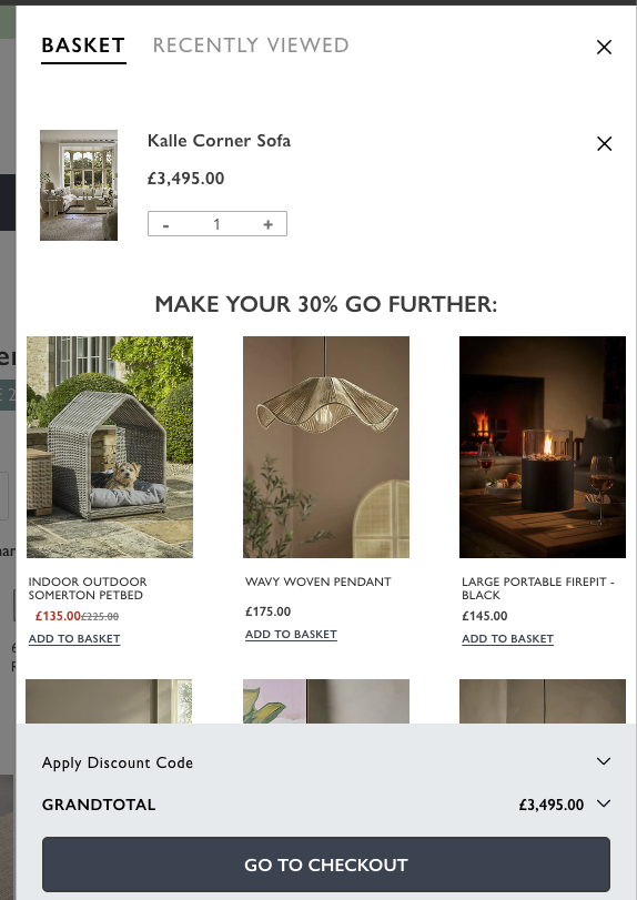
Another from Cox & Cox; once you have added your item to cart, you are immediately prompted with relevant accessories and a reminder about making the most of your discount. The relatively lower spend items also don’t seem like a big decision when compared to buying the £3.5k sofa.
Missing the trust signals that buyers actually look for
Home & Garden customers want to know: Will it actually arrive? Will it look like the photo? What happens if it’s damaged? Can I return it? Who is this company? Most stores have trust signals, a badge here and a review widget there, but they’re scattered, generic and easy to miss.
How to fix: Place trust signals deliberately, at the moments doubt peaks: near the price, near the delivery information and near the checkout button. Be specific, because specific beats generic every time. “Plants guaranteed to arrive healthy, or we’ll replace them free” beats “Quality guaranteed.” “Tracked delivery in 2 to 3 working days” beats “Fast delivery.” Real customer photos in reviews beat star ratings alone. Audit every step of your purchase journey and ask: what would remove the worry here?
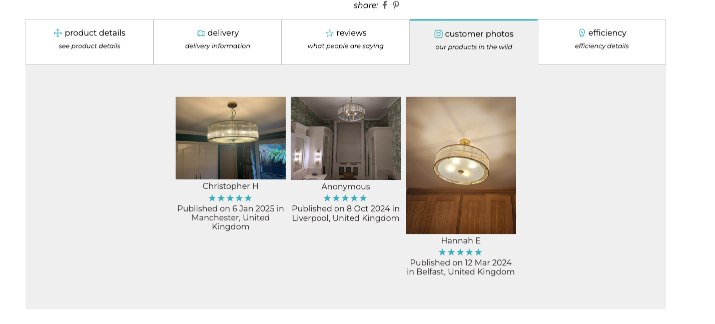
In use photography, direct from customers, is another great way to build trust with shoppers. There is no one better to advocate your brand than fellow customers.
Treating returns and guarantees as a policy page, not a sales tool
Most stores tuck their returns policy away in the footer. It’s written with a legal mindset, full of conditions and caveats, and almost impossible to find at the moment a customer needs reassurance. But Home & Garden shoppers are often nervous about size, colour and condition on arrival, especially for bulky or hard-to-judge products. A clear, generous and well-placed guarantee can be one of your strongest conversion tools.
How to fix: Bring your returns and guarantee messaging out of the footer and onto the product page, the basket and the checkout. Write it in plain, confident English. “Not right for your space? Send it back within 30 days for a full refund, no awkward questions” does more work than three paragraphs of policy. If you already offer a good policy, and most retailers do, make it a headline message, not small print.
Skipping the “why this price?” conversation
Higher-priced Home & Garden products attract a specific objection that most stores never address: why does this cost what it costs? Shoppers landing on a £2,000 dining table don’t just want to know the dimensions. They want to understand the value. What’s the frame made from? Who made it? Why does solid oak cost more than oak veneer?
When that question goes unanswered, the shopper doesn’t ask. They leave and search for a cheaper alternative.
How to fix: Build value justification directly into the product page. Use a vivid description that explains materials, craftsmanship, sourcing, or longevity. Frame it as education, not defence. Shoppers who understand what they’re paying for convert at a significantly higher rate and return fewer items.
The common theme
Every point above comes back to the same idea: Home & Garden shoppers are making considered, emotional, trust-driven decisions, whatever they’re spending. Stores that treat it like transactional retail leave sales on the table. Stores that understand how their customers actually decide, and design every step of the journey around that, build higher-converting sites, bigger baskets and customers who come back.